How we... redesigned Player FM

This article is at least a year old
Launched by ex-Googler Michael Mahemoff in 2011, Player FM is one of the oldest and best-known podcast apps, especially for Android users, for whom it was one of the first fully-featured podcast apps.
After the app’s acquisition by Maple Media in May 2020, the new team embarked on a redesign. Here’s what they did, and why - and some thoughts about how to make podcasting better for everyone.
We asked the Maple Media team a number of questions about the redesign, and what it does. Answers here are lightly edited from a series of emails.

The brand new features
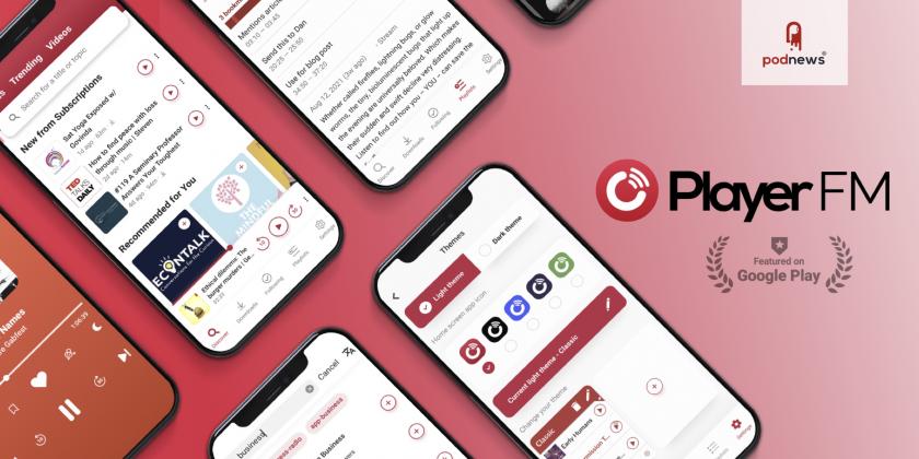
The entire Player FM in-app experience was reimagined to be fun, intuitive, and to ultimately give users more control of their listening habits. The full-screen player and discovery screens are prime examples of how the new UI caters to podcast fans through Player FM’s unique product features.
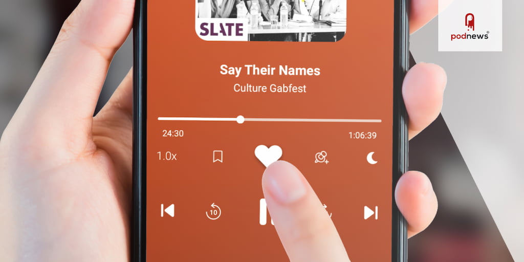
Video podcasts were repositioned on the Discover screen for a more prominent view. The new UI/UX also includes larger, more visible podcast cover art, elevated bookmarking, playlist creation, and the ability to “like” a show or episode directly from the full-screen player.
The Player FM redesign also introduces an advanced theme system where users can create their own custom podcast player. Podcast producers can also leverage built-in discoverability features that translate to the app’s dashboard to connect them with new audience members.
The redesign also includes intelligent messaging to highlight premium benefits when users need them most: for example, a suggestion to subscribe to Space Saver when a storage on a user’s device becomes low.
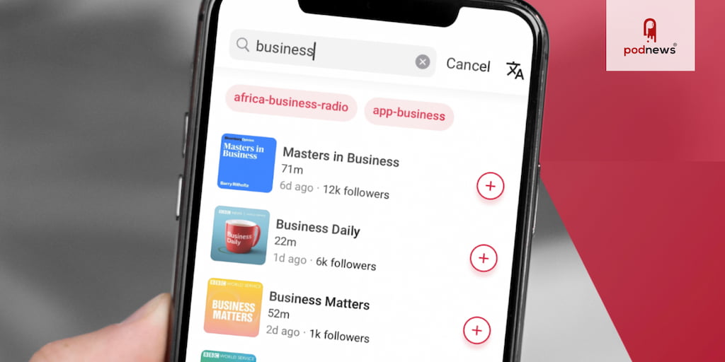
The advanced podcast list & subscription management options allow users to engage with individual episodes before subscribing to an entire series. For seamless, everyday use, the app has settings to play episodes later, or to only play episodes the user has previously liked.
Upgrading to a premium subscription gives users even more security and control. Whitelist or blacklist WiFi networks, receive new episodes quicker with the Turbo Fetch feature, and compress up to 30MB with the new Space Saver option. Upgrading also unlocks a collection of relaxation & sleep sounds, 9 unique custom app icon designs, and a personalized search feature to easily locate episodes from subscription playlists.
What research was done?
The global diversity of the user base, combined with cross-platform support, and the recent surge in podcasting’s popularity, spurred the need to reimagine a cohesive experience across all devices and platforms. Initially launched as an Android app, the original user interface and design elements had hard corners and more ‘blocky’ design overall (fitting with the earlier Android aesthetic). The redesign elevated the user experience by implementing a more modern & sleek rounded design that would appeal to a wider audience without alienating the existing user base.
Attention was also focused on improving the new user onboarding experience, introducing them to the platform in a friendly, approachable, and helpful way.
The redesign also prioritizes content discoverability. A new carousel sits prominently at the top of the home screen to feature multiple creators & shows. Showcasing a variety of content in this way makes it easier for users to find, follow, and listen to more podcasts. This improved discovery directly impacts and increases user engagement and listening frequency, which in turn allows Player FM to offer more sponsored content and advertising opportunities.

What effect has it had?
It’s been well-received by the community. Our top reviewers love the new ability to discover new content with the finely-tuned AI search engine and advanced episode-level search. These features generate highly-curated lists of personalized podcast recommendations tailored to the user’s unique listening habits.
Player FM’s redesign was selected by the Google Play Store’s editorial board and featured in the highly-selective “Recently Updated” apps section, which highlights popular app that have undergone recent product updates.
The redesign coincides with several business development initiatives, which are central to driving the Player FM brand.
The redesign has improved our advertising and subscription businesses. Following the launch of the redesign, all available advertising inventory sold out through the remainder of the Q3. We’ve just opened up advertising inventory for Q4 2021 & Q1 2022, and are currently over 50% sold.

How can podcasters help?
Including correct episode duration in the RSS feed would greatly improve user experience, as it helps users determine at a glance if they have time to listen to a particular episode, or if they prefer to save it for later.
Including chapters benefits long-form audio content, allowing listeners to break up the listening experience as they wish, and easily return to where they previously left off, or jump to a particular point.
There is an established RSS standard, and sticking to that makes for the best user experience. When publishers attempt to insert additional data, or ‘hack’ the process, it can lead to a frustration from users.
Occasionally, too, there is inconsistency in the episode file in the feed, and the actual file format - some files that show as “.mp3” sometimes redirect to another file type, which can be disconcerting to listeners.
- Player FM is available, free, on Google Play and the Apple App Store.


